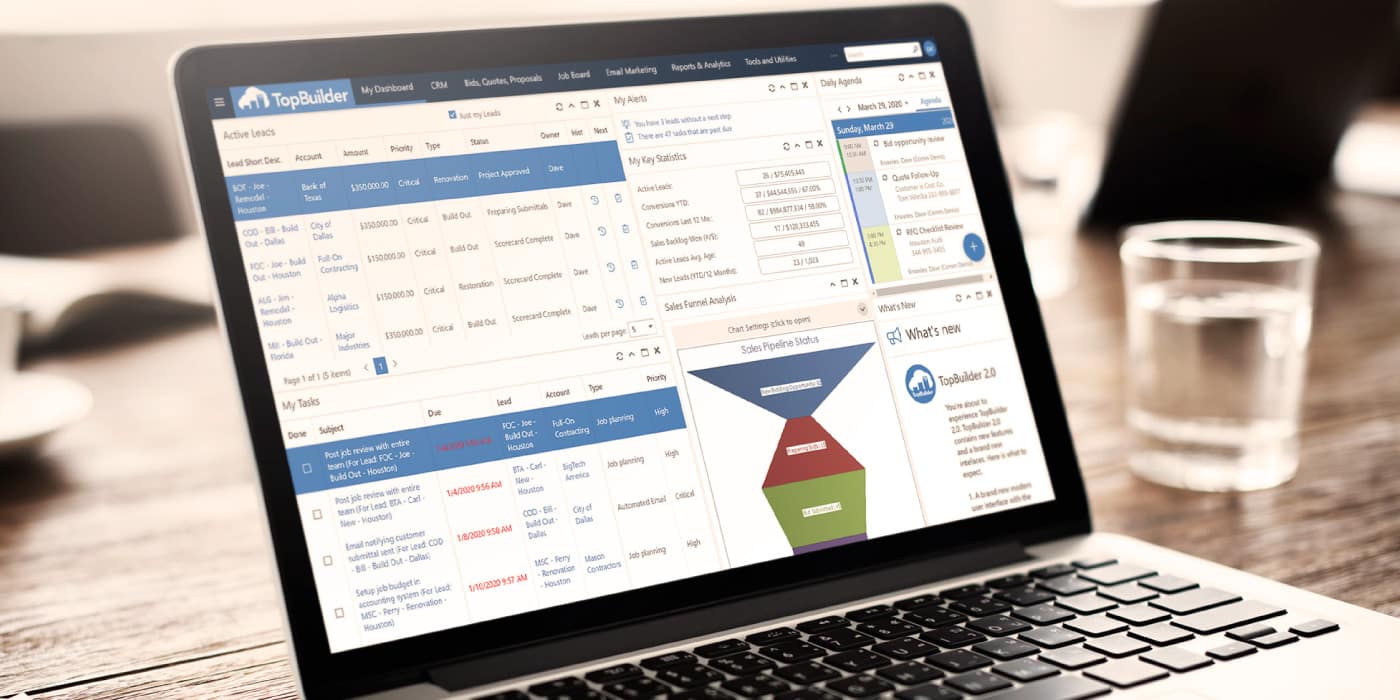
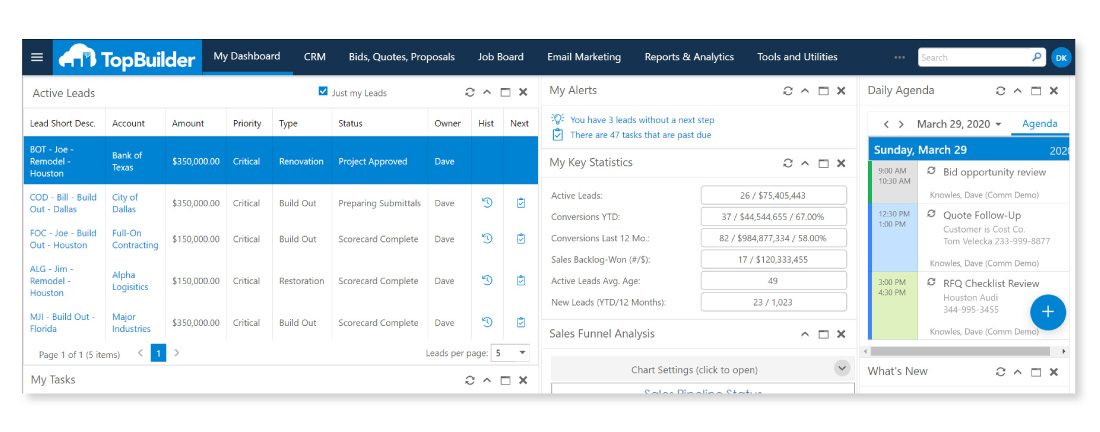
As many of you have already noticed, we’ve updated our logo, colors, and fonts.
The updates to our brand image have been occurring slowly over the past few months. It started with our logo, next was the website, and now, we’re changing our software. Launching this week, the TopBuilder software will receive a variety of updates, upgrades, and additions. One of those major changes is our new look.
We want to emphasize, it’s still the same software you have grown to love, but with a brand new look. Below we will be outlining a few of the major changes you can expect to see with the launch of TopBuilder 2.0.
–
3 New Look & Feel Updates to TopBuilder 2.0
–
1. New Logo & Colors
Yes, the old TopBuilder logo has been replaced. With this logo change, we also updated the colors seen throughout the software.
This change is most obvious with the removal of all powder blue backgrounds. These powder blue backgrounds have been replaced with the new TopBuilder color palette. Additionally, many of the old icons have been completely removed or replaced with simpler, cleaner looking icons.
–
2. Improved Navigation
With the launch of TopBuilder 2.0, we wanted to make it easier for you to find the information you needed.
To help accomplish this, we’ve adjusted our menu systems. Our first cosmetic change was to make the top header a contrasting color from the information below. Additionally, we’ve adjusted our sub-headers to display buttons. That way you can quickly see where to save, delete, and/or create new.
Additionally, we’ve decided to add a new menu system. This can be found by clicking the hamburger menu to the left of the TopBuilder logo. This will give you additional functionality over the page you’re viewing. We’ll be highlighting this information more in this week’s Feature Highlight.
–
3. Cleaner Page Layout
This was one of the largest changes we implemented with the new look and feel of TopBuilder 2.0.
It was our decision to make every page look less cluttered. In other words, we wanted to simplify the viewing experience and make it easier to find information that’s been added to each page. To begin, we’ve moved the titles for each input field above the form, rather than next to it. Additionally, we’ve been working on making each input field the same width. Lastly, we made the forms with text added highlighted, that way your eyes are naturally drawn to fields with information. Making it easier for your team to quickly see the most important information for each contact.
–
Final Comments
Our team at Topbuilder is excited and proud to share all of these updates and changes. Of course, our work is never fully complete as we are always working to make TopBuilder the best sales and marketing software for you, but this is a huge step forward.
As we proceed with our launch of TopBuilder 2.0. We will be holding dedicated training sessions for anyone wanting a deeper dive into each major change. Stay tuned, we’ll be announcing these training sessions next week.